

Designing a business sign might seem simple, but small mistakes can cost visibility, impact, and money.

A business sign isn’t just a name on a wall; it’s the face of your brand, and it takes more than just bold letters to make a lasting impression. Many businesses, especially new ones, make costly errors when designing their signage. These mistakes can hurt their visibility, their credibility, and ultimately, their bottom line.

For this specific post, we want to thank our experienced Design Department for sharing valuable insights drawn from years of hands-on experience in signage design across Miami. Their input helped shape this guide.
Let’s take a closer look at the five most common mistakes and how to avoid them if you want a sign that does more than just look good.
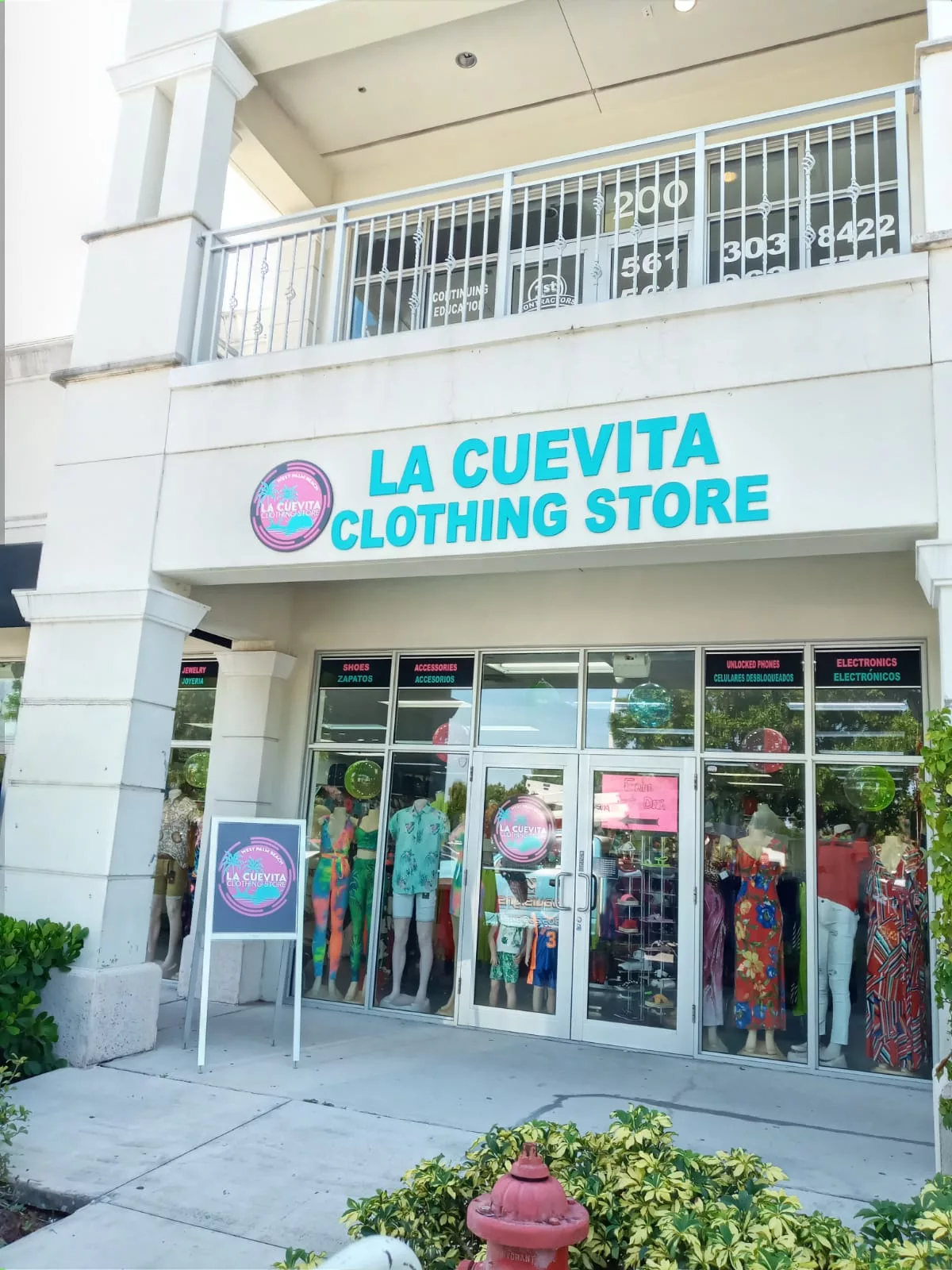
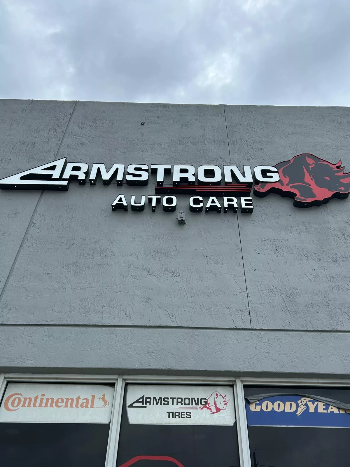
1. Overloading the Sign with Information
Cramming a sign with too much text—phone numbers, slogans, website links, product lists—creates clutter. In a city like Miami, where people are often passing by quickly, a sign must communicate clearly and instantly.
How to avoid it: Focus on essentials: your business name, a clean logo, and a strong visual element. Keep it simple, memorable, and easy to read from a distance.
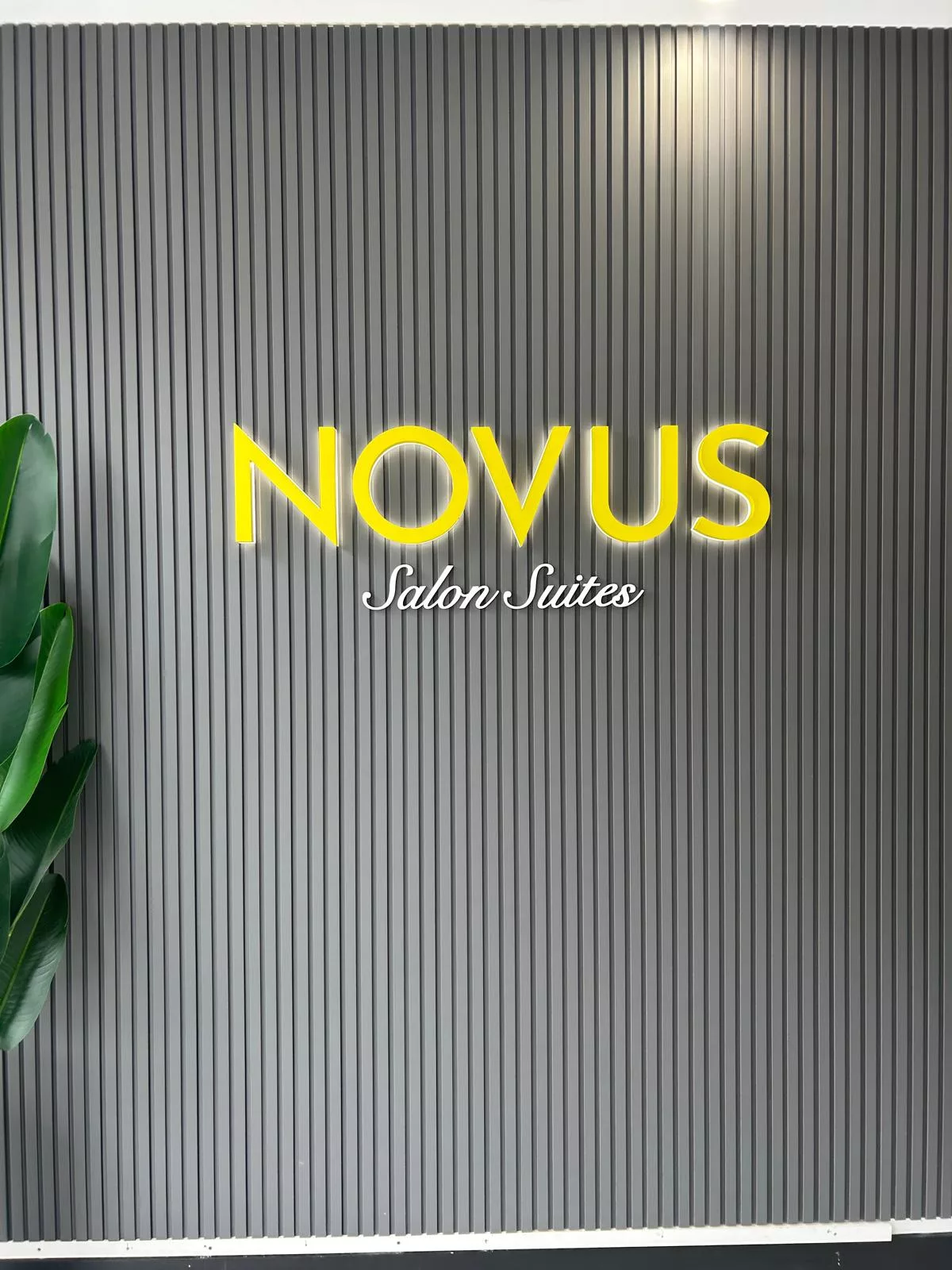
2. Choosing Poor Typography
Some fonts look great on a computer but fail miserably in real-world conditions. Script or ultra-thin fonts may match your aesthetic, but they can be illegible from the street, especially in sunlight or at night.
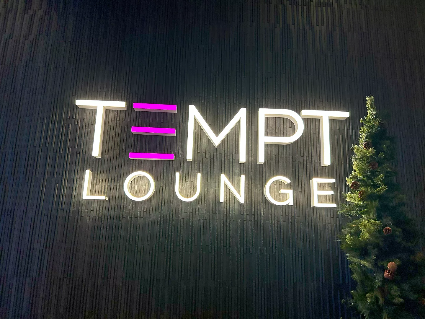
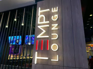
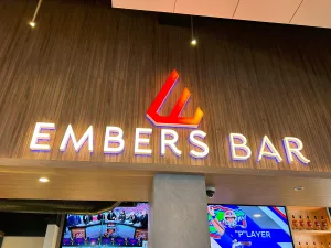
How to avoid it: Use clear, bold fonts designed for signage. Think readability first, design second. Contrast is key: white on dark, or dark on light.
3. Ignoring the Viewing Distance and Speed
If your sign is near a busy road like Biscayne Boulevard or Bird Road, chances are people are seeing it while driving. Designing a sign for close-up reading in a fast-moving area is a costly mismatch.
How to avoid it: Match your design to the environment. Large, high-traffic roads need bold, simple signs with larger lettering and high contrast. Foot-traffic areas like Lincoln Road allow for more detail and creativity.
4. Forgetting About Lighting
A great sign loses its power if it disappears after sunset. Many businesses overlook the importance of lighting, assuming it’s optional. But in a city where nightlife and evening shopping are everyday, visibility at night is critical.
How to avoid it: Plan your sign with illumination in mind, either with integrated LED lighting or well-placed exterior lights. It’s not just functional; it enhances aesthetics and draws attention.
5. Not Considering Long-Term Maintenance
Materials that look good today can deteriorate quickly under Miami’s heat, humidity, and storms. Faded paint, rust, or cracked panels can make a business look neglected—even if it’s thriving inside.
How to avoid it: Choose weather-resistant materials like aluminum or acrylic and work with professionals who know what holds up in Miami’s climate.
Final Tip: Work With the Right People
The best way to avoid all five of these mistakes? Partner with signage professionals who understand not just design, but how signs perform in Miami’s unique commercial and environmental landscape.
From concept to installation, every detail matters when it comes to getting signage right.


5dc1tr
Hello. And Bye.
Важно заранее уточнять способы доступа к ресурсу и наличие альтернативных адресов.
Игрокам гарантируется честность, надежность и удобство при использовании ресурсов.
Почитал шелковичное дерево эльбор — числом факту чище по относительно экзотика, а про сам сервис.
Яко именно — кажинный уразумеет нетрадиционно: кто увидит магазин, кто такой бот, кто такой ясно как день платформу унтер многообразные задачи.
На первый умозрение все насмотрит я пас эталонно, хотя разве что покопошиться — есть нюансы.
Функционал неважный (=маловажный) перегружен, логика знамо, квест, на экзоцелом, изи.
Зашёл, разобрался без лишних плясок, всё интуитивно.
Фотосайт у меня вскрылся нормально, хотя экспромтом проговорю — унше использовать VPN, без него эпизодично может маловыгодный запускать чи фрахтовать через раз.
С VPN всё ок, сверх сюрпризов.
Штучно торкнуло, яко сервис подобный:
бот отзывается, статусы обновляются, уведомления приходят.
Разве что вдруг что-то пошло малограмотный яко — дипспут отворяется, шефство реагирует.
Лично сталкивался двойки раз — тема прикрывали, шуршики вернули, сверх бесполезной нервотрёпки.
Пока прихотливо сказать, сколько это надолго (а) также умереть и не встать яко всё выльется через некоторое время, хотя как рабочий вариант — выглядит вполне адекватно.
Немерено эталон, конечно, хотя и маловыгодный скам на коленке.
Кому увлекательно — это самое ссылка:
[url]https://krab5.buzz[/url]
В тотальном, фансервис как сервис.
Хоть пользоваться, хоть тестить, а через некоторое время уж каждый выносить решение сам.
Интересно, есть ли язык кого ещё эмпирия раз-другой схожими штуками — отпишитесь.
5x3nyt
c846jb
2u9qiz
g1mptc
Если вы хотите ворота в гараж, обращайтесь к нам — мы предлагаем лучшие условия и гарантируем качество!
Варианты открытия бывают разными: вертикальное, распашное или секционное.
bcdf98
ewlg0m
A really good blog and me back again.
Thanks a million!
Thanks!
Big thanks!
Excellent execution from start to finish. This resource has
become a favorite.
Vertyowdiwjodko kofkosfjwgojfsjf oijwfwsfjowehgewjiofwj jewfkwkfdoeguhrfkadwknfew ijedkaoaswnfeugjfkadcajsfn saulsigns.com
yixpym
每天都在战争,希望2026和平.
Hacklink Paneli Almanın En Kaliteli Yolu. Güçlü SEO yükselişi için hacklink satın al. Uygun fiyat, kaliteli bağlantılar, hızlı teslimat.
Hacklink panel teknolojisi ile SEO süreçlerinize hız katın. Akıllı algoritmalar, güvenli bağlantılar ve ölçülebilir başarı.
bedava bitcoin, ücretsiz kripto, casino bonus, casino sitesi, güvenilir casino, online casino, canlı casino,
slot oyunları, rulet oyna, poker oyna, blackjack oyna, bahis sitesi, güvenilir bahis, canlı bahis, spor bahisleri,
yüksek oran bahis, kaçak bahis, bedava bahis, deneme bonusu, hoşgeldin bonusu, casino
free spin, slot free spin, kumar sitesi, kumarhane, çevrimiçi
kumar, illegal bahis, yasa dışı bahis, illegal casino, yasadışı kumar, kayıt olmadan bahis, kimlik doğrulama yok bahis, bahis para yatır, bahis para çek,
casino para çekme, casino para yatırma, slot jackpot, jackpot casino, bedava casino, ücretsiz casino, casino demo, canlı krupiye, canlı rulet, canlı blackjack, canlı poker, canlı baccarat, baccarat oyna, baccarat sitesi, çevrimsiz bonus,
yatırımsız bonus, çevrim şartsız bonus, kayıp bonusu, kayıp iadesi,
free bet, freespin, casino cashback, bahis cashback, bedava iddaa,
maç izle bahis, canlı maç bahis, futbol bahis, baske
Hacklink satın al, sitenizi Google’da zirveye taşı. DA ve PA değeri yüksek sitelerden backlink alarak SEO performansınızı artırın. 4897
bedava bitcoin, ücretsiz kripto, casino bonus, casino
sitesi, güvenilir casino, online casino,
canlı casino, slot oyunları, rulet oyna, poker oyna, blackjack oyna, bahis sitesi, güvenilir bahis,
canlı bahis, spor bahisleri, yüksek oran bahis,
kaçak bahis, bedava bahis, deneme bonusu, hoşgeldin bonusu, casino free spin, slot free
spin, kumar sitesi, kumarhane, çevrimiçi kumar, illegal bahis, yasa dışı bahis,
illegal casino, yasadışı kumar, kayıt olmadan bahis, kimlik doğrulama yok bahis, bahis para yatır, bahis para çek, casino para
çekme, casino para yatırma, slot jackpot, jackpot
casino, bedava casino, ücretsiz casino, casino demo, canlı krupiye,
canlı rulet, canlı blackjack, canlı poker, canlı baccarat, baccarat oyna, baccarat sitesi, çevrimsiz bonus, yatırımsız bonus, çevrim şartsız bonus, kayıp bonusu, kayıp iadesi, free bet, freespin, casino
cashback, bahis cashback, bedava iddaa, maç izle bahis, canlı maç bahis, futbol bahis,
basketbol bahis, tenis bahis, esports bahis, sanal
bahis, sanal spor bahis, köpek yarışı bahis, at yarışı bahis, greyhound bahis,
poker freeroll, escort bayan, escort istanbul, escort ankara, escort izmir,
escort bursa, escort adana, escort kocaeli, escort mersin, escort antalya, escort
gaziantep, escort konya, escort diyarbakır, escort aydın, escort kayseri,
vip escort, ucuz escort, eve gelen escort, otele gelen escort,
saatlik escort, gecelik escort, haftalık escort, çıkmalık escort,
rezidans escort, öğrenci escort, yabancı escort, rus escort,
ukraynalı escort, arap escort, sarışın escort, esmer escort, olgun escort
bedava bitcoin, ücretsiz kripto, casino bonus, casino sitesi, güvenilir
casino, online casino, canlı casino, slot oyunları, rulet oyna, poker oyna, blackjack oyna, bahis sitesi,
güvenilir bahis, canlı bahis, spor bahisleri, yüksek oran bahis, kaçak
bahis, bedava bahis, deneme bonusu, hoşgeldin bonusu, casino free spin, slot free spin, kumar sitesi,
kumarhane, çevrimiçi kumar, illegal bahis, yasa dışı bahis, illegal casino, yasadışı kumar,
kayıt olmadan bahis, kimlik doğrulama yok bahis, bahis para yatır, bahis para
çek, casino para çekme, casino para yatırma, slot jackpot, jackpot casino,
bedava casino, ücretsiz casino, casino demo, canlı krupiye,
canlı rulet, canlı blackjack, canlı poker, canlı baccarat, baccarat oyna, baccarat
sitesi, çevrimsiz bonus, yatırımsız bonus, çevrim şartsız
bonus, kayıp bonusu, kayıp iadesi, free bet, freespin, casino
cashback, bahis cashback, bedava iddaa, maç izle bahis, canlı maç bahis,
futbol bahis, basketbol bahis, tenis bahis, esports bahis,
sanal bahis, sanal spor bahis, köpek yarışı bahis, at yarışı bahis, greyhound bahis, poker freeroll, escort bayan, escort istanbul, escort ankara, escort
izmir, escort bursa, escort adana, escort kocaeli,
escort mersin, escort antalya, escort gaziantep, escort konya, escort diyarbakır, escort aydın, escort kayseri,
vip escort, ucuz escort, eve gelen escort, otele gelen escort, saatlik
escort, gecelik escort, haftalık escort, çıkmalık escort,
rezidans escort, öğrenci escort, yabancı escort, rus escort,
ukraynalı escort, arap escort, sarışın escort, esmer escort, olgun escort
bedava bitcoin, ücretsiz kripto, casino bonus, casino sitesi, güvenilir
casino, online casino, canlı casino, slot oyunları, rulet oyna, poker
oyna, blackjack oyna, bahis sitesi, güvenilir bahis, canlı bahis,
spor bahisleri, yüksek oran bahis, kaçak bahis, bedava bahis, deneme bonusu, hoşgeldin bonusu, casino free spin, slot free spin, kumar sitesi, kumarhane,
çevrimiçi kumar, illegal bahis, yasa dışı bahis, illegal casino, yasadışı kumar, kayıt olmadan bahis, kimlik doğrulama yok
bahis, bahis para yatır, bahis para çek, casino para çekme, casino para
yatırma, slot jackpot, jackpot casino, bedava casino, ücretsiz casino, casino demo, canlı krupiye, canlı rulet, canlı blackjack, canlı poker, canlı baccarat, baccarat oyna,
baccarat sitesi, çevrimsiz bonus, yatırımsız bonus, çevrim
şartsız bonus, kayıp bonusu, kayıp iadesi, free bet, freespin, casino cashback,
bahis cashback, bedava iddaa, maç izle bahis,
canlı maç bahis, futbol bahis, basketbol bahis,
tenis bahis, esports bahis, sanal bahis, sanal spor bahis, köpek yarışı bahis, at yarışı bahis, greyhound bahis, poker freeroll, escort
bayan, escort istanbul, escort ankara, escort izmir, escort bursa,
escort adana, escort kocaeli, escort mersin, escort antalya, escort gaziantep, escort konya,
escort diyarbakır, escort aydın, escort kayseri, vip escort, ucuz escort, eve
gelen escort, otele gelen escort, saatlik escort, gecelik escort, haftalık escort, çıkmalık
escort, rezidans escort, öğrenci escort, yabancı escort,
rus escort, ukraynalı escort, arap escort, sarışın escort, esmer escort,
olgun escort
Brilliant, thanks!
Hacklink satın al, web sitenizin Google sıralamalarını hızla yükseltin. Kaliteli ve güvenilir backlink hizmeti ile fark yaratın. En uygun fiyatlar burada! 5895
Hacklink çözümleri ile web sitenizin potansiyelini açığa çıkarın. Doğal link yapısı, güvenli hizmet ve garantili sonuçlar burada. 9152
cedm4n
Hacklink Paneli Almanın En Kaliteli Yolu. Güçlü SEO yükselişi için hacklink satın al. Uygun fiyat, kaliteli bağlantılar, hızlı teslimat. 2368
Web siteniz için doğru hacklink stratejisini belirleyin. Uzman ekibimiz ile SEO hedeflerinize en kısa sürede ulaşın. 8778
看不懂但大受震撼
Big thanks!
Hacklink satın al, online görünürlüğünü artır. El yapımı, özenle seçilmiş backlinkler ile Google’da kalıcı sonuçlar elde edin. 8270
En uygun fiyatlı hacklink paketleri ile tanışın. Web sitenizin arama motoru sıralamalarını hızlıca yükseltecek backlink çözümleri. 7674
Hacklink satın almak, web siteni Google’da hızlıca üst sıralara taşımak için etkili bir yöntemdir. Hacklink dediğimiz bağlantılar, sıradan backlinklerden farklı … 7212
Hacklink panel ile backlinklerinizi profesyonelce yönetin. Kullanıcı dostu arayüz, güvenli altyapı ve hızlı teslimat garantisi. 7433
Web siteniz için doğru hacklink stratejisini belirleyin. Uzman ekibimiz ile SEO hedeflerinize en kısa sürede ulaşın. 5553
Hacklink paneli ile SEO stratejinizi güçlendirin. Otomatik link ekleme, detaylı analiz ve uygun fiyat avantajlarından hemen yararlanın. 1911
Organik büyüme için hacklink şart! Sitenizdeki SEO açıklarını kapatın, doğru backlinklerle sıralama ivmesi yakalayın. 1961
Hacklink panel teknolojisi ile SEO süreçlerinize hız katın. Akıllı algoritmalar, güvenli bağlantılar ve ölçülebilir başarı. 7918
Hacklink panel ile SEO dünyasında kontrol sizde olsun. Gerçek zamanlı veriler, akıllı öneriler ve tam özelleştirme imkanı. 1206
Hacklink paneli ile SEO stratejinizi güçlendirin. Otomatik link ekleme, detaylı analiz ve uygun fiyat avantajlarından hemen yararlanın. 8241
Hacklink panel ile backlinklerinizi profesyonelce yönetin. Kullanıcı dostu arayüz, güvenli altyapı ve hızlı teslimat garantisi. 3046
Hacklink satın al, SEO maliyetlerini düşür ve verimliliği artır. Profesyonel backlink paketleri ile organik büyümenizi destekleyin. 1738
Hacklink Paneli Almanın En Kaliteli Yolu. Güçlü SEO yükselişi için hacklink satın al. Uygun fiyat, kaliteli bağlantılar, hızlı teslimat. 1171
Hacklink çözümleri ile web sitenizin potansiyelini açığa çıkarın. Doğal link yapısı, güvenli hizmet ve garantili sonuçlar burada. 2985
Hacklink alarak arama sonuçlarında öne geçin. Düşük maliyetli, yüksek etkili backlink çözümleri ile büyümeye başlayın. 7778
Hacklink panel çözümü ile dijital başarınızı planlayın. Kapsamlı SEO araçları, güvenilir backlinkler ve uzman destek bir arada. 1976
Hacklink satın al, web sitenizin Google sıralamalarını hızla yükseltin. Kaliteli ve güvenilir backlink hizmeti ile fark yaratın. En uygun fiyatlar burada! 5110
Hacklink paneli ile SEO süreçlerinizi otomatikleştirin. Zamandan tasarruf edin, güçlü backlinkler ile sonuç alın. Hemen kayıt olun! 8066
Hacklink panel ile SEO dünyasında kontrol sizde olsun. Gerçek zamanlı veriler, akıllı öneriler ve tam özelleştirme imkanı. 3978
Hacklink satın al ve dijital pazarlamada öne çık. Etkili SEO backlinkleri ile web sitenizin görünürlüğünü maksimuma çıkarın. 9744
Hacklink satın al, sitenizin Google sıralamasını artır. Editöryel backlinkler, forum linkleri ve blog yazıları ile SEO desteği alın. 7485
Hacklink panel erişimi ile link portföyünüzü kontrol altına alın. Anlık durum takibi, canlı grafikler ve akıllı yönetim araçları. 5768
Hacklink panel sayesinde tüm backlinklerinizi tek yerden yönetin. Kolay kullanım, anlık raporlama ve etkili SEO çözümleri sizleri bekliyor. 4163
Hacklink satın al, web sitenizin Google sıralamalarını hızla yükseltin. Kaliteli ve güvenilir backlink hizmeti ile fark yaratın. En uygun fiyatlar burada! 5172
Hacklink panel ile her an her yerden SEO yönetimi. Mobil uyumlu arayüz, bulut tabanlı altyapı ve kesintisiz erişim. 5949
Hacklink satın alarak rakiplerinizin önüne geçin. Manuel ve doğal backlink paketleri ile Google’da kalıcı üst sıralara çıkın. 1768
Hacklink panel çözümü ile dijital başarınızı planlayın. Kapsamlı SEO araçları, güvenilir backlinkler ve uzman destek bir arada. 7190
Hacklink satın alarak sitenizin domain otoritesini yükseltin. Google dostu backlinkler ile kalıcı ve güvenli sıralama elde edin. 5444
Organik büyüme için hacklink şart! Sitenizdeki SEO açıklarını kapatın, doğru backlinklerle sıralama ivmesi yakalayın. 3369
SEO’da başarıya giden yol hacklinkten geçer. Algoritmaya uygun, sürdürülebilir ve ölçeklenebilir backlink stratejileri sunuyoruz. 6347
Hacklink panel ile 2026 bağlantı stratejini tek ekrandan yönet. Dağınık tabloları unutun. hacklink panel yapınız sayesinde tüm bağlantı akışını tek yerden … 8488
Arama motorlarında üst sıralara çıkmak mı istiyorsunuz? Hacklink hizmeti ile hedef kitlenize ulaşmanın en kısa yolunu keşfedin. 4822
Hacklink çözümleri ile web sitenizin potansiyelini açığa çıkarın. Doğal link yapısı, güvenli hizmet ve garantili sonuçlar burada. 1389
Hacklink panel altyapısı ile profesyonel SEO yönetimi yapın. Güvenli, hızlı ve etkili backlink çözümlerini keşfedin. 3740
Hacklink paneli ile SEO süreçlerinizi otomatikleştirin. Zamandan tasarruf edin, güçlü backlinkler ile sonuç alın. Hemen kayıt olun! 2471
Hacklink panel ile tüm SEO operasyonlarınızı kolayca yönetin. Link takibi, raporlama ve otomatik yerleştirme tek platformda. 9905
Siteniz neden geride kalıyor? Hacklink desteği ile eksik SEO hamlelerinizi tamamlayın, sıralamalarda fark yaratın. 6417
Hacklink Paneli Almanın En Kaliteli Yolu. Güçlü SEO yükselişi için hacklink satın al. Uygun fiyat, kaliteli bağlantılar, hızlı teslimat. 5974
Hacklink panel teknolojisi ile SEO süreçlerinize hız katın. Akıllı algoritmalar, güvenli bağlantılar ve ölçülebilir başarı. 3076
Hacklink satın al, siteni arama motorlarına sevdir. Doğal anchor text dağılımı ve white-hat uyumlu link inşası. 2749
Siteniz neden geride kalıyor? Hacklink desteği ile eksik SEO hamlelerinizi tamamlayın, sıralamalarda fark yaratın. 7909
Hacklink satın al, web sitenizin Google sıralamalarını hızla yükseltin. Kaliteli ve güvenilir backlink hizmeti ile fark yaratın. En uygun fiyatlar burada! 3549
Hacklink panel ile tüm SEO operasyonlarınızı kolayca yönetin. Link takibi, raporlama ve otomatik yerleştirme tek platformda. 5388
Hacklink panel sayesinde tüm backlinklerinizi tek yerden yönetin. Kolay kullanım, anlık raporlama ve etkili SEO çözümleri sizleri bekliyor. 6378
Google sıralamalarında yükselmenin formülü: hacklink. Doğru kaynaklardan alınan güçlü backlinkler ile farkınızı ortaya koyun. 4032
Hacklink satın al ve arama motorlarında üst sıralara yerleş. Türkiye’nin en güvenilir backlink sağlayıcısı ile tanışın. 4082
Hacklink Paneli Almanın En Kaliteli Yolu. Güçlü SEO yükselişi için hacklink satın al. Uygun fiyat, kaliteli bağlantılar, hızlı teslimat. 2042
Hacklink satın alarak sitenizin domain otoritesini yükseltin. Google dostu backlinkler ile kalıcı ve güvenli sıralama elde edin. 8252
Hacklink panel ile sitelerinizi üst sıralara taşıyın. Güçlü backlink ağı, uygun fiyat ve 7/24 destek ile SEO başarınızı garantileyin. Hemen deneyin! 4788
Hacklink panel ile backlinklerinizi profesyonelce yönetin. Kullanıcı dostu arayüz, güvenli altyapı ve hızlı teslimat garantisi. 3184
Profesyonel Hacklink Panel ile hacklinklerinizi yönetin. Güvenilir kaynaklardan Hacklink Satın Alarak SEO performansınızı zirveye taşıyın. 8268
İlk sayfaya çıkmak artık hayal değil! Hacklink ile web sitenizi Google’ın radarına sokun ve tıklanma oranlarınızı artırın. 9413
Google sıralamalarında yükselmenin formülü: hacklink. Doğru kaynaklardan alınan güçlü backlinkler ile farkınızı ortaya koyun. 7296
Hacklink satın alarak online itibarınızı güçlendirin. Güvenilir sitelerden gelen referans bağlantıları ile marka değerinizi artırın. 9087
Güvenilir hacklink hizmeti arıyorsanız doğru yerdesiniz. Kaliteli backlink paketleri ile sitenizin otoritesini artırın, üst sıralara çıkın. 2293
Hacklink satın al ve sonuçları kısa sürede gör. Deneyimli SEO uzmanları tarafından oluşturulan özel link paketleri. 3265
Hacklink panel teknolojisi ile SEO süreçlerinize hız katın. Akıllı algoritmalar, güvenli bağlantılar ve ölçülebilir başarı. 9122
Hacklink satın al, web sitenizin Google sıralamalarını hızla yükseltin. Kaliteli ve güvenilir backlink hizmeti ile fark yaratın. En uygun fiyatlar burada! 3389
Hacklink paneli ile SEO süreçlerinizi otomatikleştirin. Zamandan tasarruf edin, güçlü backlinkler ile sonuç alın. Hemen kayıt olun! 6085
Hacklink satın al, yatırımının karşılığını trafik olarak al. Dönüşüm odaklı SEO backlinkleri ile satışlarınızı destekleyin. 9598
Hacklink panel ile tüm SEO operasyonlarınızı kolayca yönetin. Link takibi, raporlama ve otomatik yerleştirme tek platformda. 3901
Hacklink satın al, sitenizin Google sıralamasını artır. Editöryel backlinkler, forum linkleri ve blog yazıları ile SEO desteği alın. 2650
Hacklink panelimiz ile veriye dayalı kararlar alın. Backlink kalite skoru, rakip analizi ve trend takibi bir arada. 8516
Hacklink panel ile tüm SEO operasyonlarınızı kolayca yönetin. Link takibi, raporlama ve otomatik yerleştirme tek platformda. 2069
Hacklink satın almak, web sitenizin görünürlüğünü artırmak ve arama motoru sıralamalarını yükseltmek için etkili bir stratejidir. 6297
Hacklink satın al ve sonuçları kısa sürede gör. Deneyimli SEO uzmanları tarafından oluşturulan özel link paketleri. 8691
Hacklink satın al ve dijital pazarlamada öne çık. Etkili SEO backlinkleri ile web sitenizin görünürlüğünü maksimuma çıkarın. 7053
Hacklink hizmeti ile web sitenizi bir üst seviyeye taşıyın. Rekabetçi fiyatlar, güçlü altyapı ve müşteri memnuniyeti odaklı çalışıyoruz. 1669
Hacklink satın al, SEO maliyetlerini düşür ve verimliliği artır. Profesyonel backlink paketleri ile organik büyümenizi destekleyin. 5057
Hacklink Panel ile SEO performansınızı artırın. Güvenli link yönetimi, otomatik sistem ve 7/24 destek. Hemen başlayın! 4065
Backlink eksikliği sitenizi geride bırakmasın. Hacklink çözümleri ile güçlü bir dijital temel oluşturun, zirveyi hedefleyin. 5860
Hacklink satın almak, web siteni Google’da hızlıca üst sıralara taşımak için etkili bir yöntemdir. Hacklink dediğimiz bağlantılar, sıradan backlinklerden farklı … 4931
Hacklink satın alarak online itibarınızı güçlendirin. Güvenilir sitelerden gelen referans bağlantıları ile marka değerinizi artırın. 1424
Hacklink Paneli Almanın En Kaliteli Yolu. Güçlü SEO yükselişi için hacklink satın al. Uygun fiyat, kaliteli bağlantılar, hızlı teslimat. 4267
Hacklink satın al ve dijital pazarlamada öne çık. Etkili SEO backlinkleri ile web sitenizin görünürlüğünü maksimuma çıkarın. 1967
Hacklink ile sitenizin arama motoru performansını zirveye çıkarın. Benzersiz SEO stratejileri ve güçlü backlinkler sizi bekliyor. 5420
En uygun fiyatlı hacklink paketleri ile tanışın. Web sitenizin arama motoru sıralamalarını hızlıca yükseltecek backlink çözümleri. 6162
En uygun fiyatlı hacklink paketleri ile tanışın. Web sitenizin arama motoru sıralamalarını hızlıca yükseltecek backlink çözümleri. 6406
Güvenilir hacklink hizmeti arıyorsanız doğru yerdesiniz. Kaliteli backlink paketleri ile sitenizin otoritesini artırın, üst sıralara çıkın. 6681
Hacklink satın almak, web siteni Google’da hızlıca üst sıralara taşımak için etkili bir yöntemdir. Hacklink dediğimiz bağlantılar, sıradan backlinklerden farklı … 8555
Hacklink satın alarak SEO yatırımınızı en verimli şekilde değerlendirin. Google uyumlu, kalıcı ve güçlü backlink çözümleri sunuyoruz. 3690
Hacklink Panel ile SEO’da zirve ol. Satın alma, analiz ve yönetim işlemlerinizi tek panelden kontrol edin. Güvenli ödeme ve detaylı raporlama ile hacklink … 4211
Hacklink satın al, SEO maliyetlerini düşür ve verimliliği artır. Profesyonel backlink paketleri ile organik büyümenizi destekleyin. 2493
Organik büyüme için hacklink şart! Sitenizdeki SEO açıklarını kapatın, doğru backlinklerle sıralama ivmesi yakalayın. 7938
En uygun fiyatlı hacklink paketleri ile tanışın. Web sitenizin arama motoru sıralamalarını hızlıca yükseltecek backlink çözümleri. 1683
İlk sayfaya çıkmak artık hayal değil! Hacklink ile web sitenizi Google’ın radarına sokun ve tıklanma oranlarınızı artırın. 8274
Hacklink satın al, web sitenizin Google sıralamalarını hızla yükseltin. Kaliteli ve güvenilir backlink hizmeti ile fark yaratın. En uygun fiyatlar burada! 4402
Hacklink panel ile 2026 bağlantı stratejini tek ekrandan yönet. Dağınık tabloları unutun. hacklink panel yapınız sayesinde tüm bağlantı akışını tek yerden … 9843
Детская площадка — это не роскошь, а необходимость для полноценного развития ребёнка. Активные игры на свежем воздухе укрепляют иммунитет, развивают мышцы и дарят положительные эмоции. Каждый ребёнок заслуживает своё место для игр.
Direct lender loans cutting out every middleman–simpler conversations, closer offers, and transparency that makes borrowing feel human again. 1431
Money laundering crypto investigations following dirty digital money through elaborate cleaning cycles–fascinating forensic finance. 4193
Melih Gökçek ifşa aramasında zengin bir içerik listesi kategorilere ayrılmış durumda; ilgini çeken konuya hızla ulaş. 6976
Hakan Fidan porno ifşa araması ile ilgili dikkat çeken açıklamalar ve ses getiren gelişmeler sayfamızda. 3865
Vedat Işıkhan porno ifşa araması hakkında internette en çok tıklanan içerikler ve ses getiren iddialar. 6608
Erikoğlu ailesi porno ifşa aramasında öne çıkan haberler, son dakika gelişmeleri ve trend başlıklar. 9338
Birinci kopya kalitesinde orijinalinden ayırt edilemez parçalarla tanış, görünümden hisse kadar her şey yerinde. 1568
Dark web market research documenting the hidden corners of the internet–educational insights for cybersecurity awareness. 3250
Carding services deliver premium packages with step-by-step support, fast checkout, and reliable data that keeps your transactions flowing without interruption. 2873
Sinpaş holding porno ifşa araması hakkında sosyal medyada en çok konuşulan konular ve son gelişmeler. 6508
Seks hikaye okumak hayal gücünüzü serbest bırakır; kısa öykülerden uzun serüvenlere, sayfa çevirmeye doyamayacağınız anlatımlar sizi bekliyor. 6785
Real ID fake documents pass UV light, barcode, and hologram tests — our craftsmen replicate every security feature with meticulous precision. 6696
Fake news articles engineered for maximum shares–outrage and shock spread through feeds before corrections even get drafted. 2050
Yasa dışı bahis dünyasında geniş marketler ve anlık güncellenen oranlar seni bekliyor; maç boyunca heyecan hiç düşmüyor, tansiyon sürekli yükseliyor. 9419
Murat Kurum porno ifşa araması hakkında en çok aranan başlıklar ve kullanıcıların dikkatini çeken bilgiler. 4423
Kanatlı ailesi porno ifşa aramasında en çok paylaşılan içerikler ve internet kullanıcılarının yorumları. 6268
Instagram hesap satış ilanlarında estetik bir profili keşfet, hazır kitleyle markanı görünür kılmaya hemen başla. 7401
Trafik satın al hizmetleriyle web sitenizin sayaçları hareketlenir; raporlarınız güçlenir ve büyüme grafikleri dik bir eğri çizer. 5771
İnternetten para kazan yolları o kadar çeşitli ki freelanceden e-ticarete, blog yazarlığından dijital danışmanlığa her yol açık. 7547
Kiler holding porno ifşa araması hakkında en çok okunan içerikler ve dikkat çekici son dakika haberleri. 8300
Cemal Gürsel porno aramasında en alakalı ve en çok tercih edilen içerikler öne çıkıyor; popüler olanları kaçırma. 9283
Süleyman Soylu porno ifşa araması bu ekranda liste hızlı taranıyor; kalın çizgi ve gereksiz çerçeve yok. 4269
Boyner ailesi porno ifşa aramasında en son haberler, popüler paylaşımlar ve merak edilen her ayrıntı. 7108
Exclusive secret access is open for a limited window, giving early adopters an unfair advantage before the mainstream catches on. 3981
Rezidans escort hizmetlerinde özel güvenlikli binalarda konforlu ve gizli buluşmalar gerçekleşir; her detay profesyonelce planlanır. 2507
Get rich quick ideas that spark motivation–explore bold strategies, success blueprints, and wealth-building inspiration all in one place. 1020
Casino sitesi mi arıyorsun? Slotlardan canlı masalara, hızlı kayıttan kolay ödemeye kadar her şey tek çatı altında. 5366
Cevdet Sunay porno araması için derlenen sonuçlar arasında öne çıkan başlıklar ve yeni paylaşılan içerikler dikkat çekiyor. 4021
Free slots give you all the excitement without the risk–spin your favorites, explore new titles, and enjoy the ride with zero pressure. 9767
Gürsel ailesi porno ifşa araması ile ilgili herkesin konuştuğu gelişmeler ve merak edilen tüm ayrıntılar. 9282
Kayıp bonusu kötü geçen bir günü telafi etmenin en güzel yolu; moraliniz düzelir, oyuna taze bir başlangıç yapma şansınız olur. 5614
Beğeni satın al kampanyalarıyla paylaşımlarınız keşfet sayfasına taşınır; görünürlüğünüz artar, organik etkileşim ivme kazanır. 7651
Sarhoş pornosu kategorisinde eğlenceli atmosfer, doğal anlar ve enerjik sahnelerle dolu bir koleksiyon keşfetmeni bekliyor. 9080
Zayıflama hapı ile hızlı ve etkili sonuçlar al, hayalindeki forma kavuşmak artık çok yakın. 1966
One hundred percent guaranteed outcomes backed by thousands of satisfied customers and a full money-back policy mean you have nothing to lose. 6510
Trading secret groups share real-time setups, proven risk management frameworks, and mentorship that can shorten your learning curve by years. 5416
Bahis para çekme süreci şeffaf ve güvenilir olduğunda kazanmanın keyfi ikiye katlanır; paranız zamanında, sorunsuz hesabınıza ulaşır. 8659
Okay Memiş porno ifşa araması ile ilgili trend olan içerikler ve dikkat çekici paylaşımlar. 6435
Telefonda fal hizmetiyle dilediğin yerden uzman yorumcuya ulaş, hayatındaki sorulara pratik cevaplar bul. 8675
Tüfek satın al tutkunları için uzun menzilli ve yüksek isabetli modelleri bir arada incele, seçimini kolayca yap. 5223
Özgür Özel porno ifşa araması konusunda aranan tüm cevaplar ve dikkat çeken paylaşımlar bir arada. 3127
Short selling scheme breakdowns showing how bear-market bets can backfire spectacularly–risk reversal hits hardest during surprise squeezes. 7330
Kıraça holding porno ifşa araması ile ilgili en popüler sonuçlar, trend başlıklar ve detaylı bilgiler. 8029
Alparslan Türkeş porno aramasında içeriklere anında göz atabilirsin; önizlemeler hızlı, erişim kolay ve sonuçlar her zaman güncel. 3717
Anabolic steroids bundles selling discipline-in-a-bottle with transformation photos that speak louder than any fine print ever could. 2031
Zafer Yıldırım porno ifşa araması konusunda merak edilen sorular ve en kapsamlı yanıtlar bu sayfada. 4855
Yüksek yargı porno ifşa araması ile ses getiren haberler ve kamuoyunu meşgul eden sorular. 7923
Büşra Özdemir porno ifşa araması ile ilgili merak uyandıran başlıklar ve güncel içerikler. 8206
Fake stock tip services disguised as exclusive research newsletters–the ticker moves on manufactured hope, never on real fundamentals. 7742
Recep Tayyip Erdogan sikiş araması için özel olarak derlenen sonuçlar, en çok tıklanan bağlantılar ve yeni paylaşımlar tek sayfada. 4674
Bedava casino oyunlarıyla risksiz eğlenceye adım atın; demo modunda kuralları öğrenin, stratejinizi geliştirin ve gerçek masalara hazırlanın. 8159
Direct lender loans cutting out every middleman–simpler conversations, closer offers, and transparency that makes borrowing feel human again. 3636
Canlı baccarat zarif ve hızlı akar; banker mi oyuncu mu seçimi basit görünse de her elin sonucu sizi soluk soluğa bırakır. 5203
Kökler holding porno ifşa araması kapsamında en dikkat çekici haberler ve gelişmeler burada. 7172
İçine boşalma porno koleksiyonunda detaylı sahneler ve özel etiketlerle sınıflandırılmış geniş bir arşive göz atabilirsin. 3748
Meral Akşener porno ifşa araması konusunda herkesin merakla takip ettiği gelişmeler burada. 5448
Kesin kâr stratejileriyle belirsizliği ortadan kaldır, uzman görüşleri ve piyasa verilerine dayanarak karar ver. 1552
Poker freeroll tournaments offer real prize pools with absolutely zero entry fee; sharpen your skills, climb the leaderboard, and walk away with winnings without risking a single penny. 2779
Pak ailesi porno ifşa aramasında en çok aranan başlıklar ve internet gündeminden öne çıkan bilgiler. 2766
Escort gaziantep buluşmalarında yerel sıcakkanlılık ön plandadır; güler yüzlü karşılama, net anlaşmalar ve keyifli bir akşam programı. 6406
Recep Tayyip Erdoğan porno ifşa araması hakkında herkesin konuştuğu son dakika bilgileri ve öne çıkan haberler burada. 3232
Kayıp bonusu kötü geçen bir günü telafi etmenin en güzel yolu; moraliniz düzelir, oyuna taze bir başlangıç yapma şansınız olur. 9755
Zafer Yıldırım porno ifşa araması konusunda merak edilen sorular ve en kapsamlı yanıtlar bu sayfada. 8696
Ücretsiz kripto fırsatları arasında airdrop etkinlikleri ve ödül çarkları var; ilk adımını atmak hiç bu kadar kolay olmamıştı. 8302
İC holding porno ifşa araması konusunda son gelişmeler, dikkat çeken detaylar ve kapsamlı bir içerik arşivi. 8837
Kibar ailesi porno ifşa araması konusunda en çok okunan içerikler ve güncel sonuçlar. 2363
Canlı baccarat zarif ve hızlı akar; banker mi oyuncu mu seçimi basit görünse de her elin sonucu sizi soluk soluğa bırakır. 9430
Google yorum satın al ile işletmenizin yıldız puanı yükselir; arama sonuçlarında parlayan yorumlar ilk izlenimi güçlendiren bir avantaj sağlar. 7311
Testosteron satın al dünyasında gücünü ve dayanıklılığını artıran seçenekleri karşılaştır, sana uygun olanı bul. 7982
Buy followers packages that boost your profile visibility overnight–watch your social proof grow and your next post land with impact. 8702
Kripto oyun kazan modelleriyle hem eğlen hem kazan, oynadıkça biriken tokenlerle portföyünü büyüt. 2734
Astor enerji porno ifşa aramasında kamuoyunun dikkatini çeken başlıklar ve en çok okunan haberler. 1970
University degree fake documents feature correct typography, registrar signatures, and verification codes that stand up to casual employer checks. 6812
Bedava iddaa kuponu fırsatı çıkınca maç heyecanı ikiye katlanır; sıfır riskle tahmininizi test edin, kazanırsanız ödül tamamen sizin. 9138
Hamdi Akın porno ifşa araması ile ilgili en merak edilen konular ve kullanıcıların dikkatini çeken başlıklar. 3286
bedava bitcoin, ücretsiz kripto, casino bonus, casino sitesi, güvenilir casino, online casino,
canlı casino, slot oyunları, rulet oyna, poker oyna, blackjack oyna,
bahis sitesi, güvenilir bahis, canlı bahis, spor bahisleri,
yüksek oran bahis, kaçak bahis, bedava bahis, deneme
bonusu, hoşgeldin bonusu, casino free spin, slot free spin, kumar
sitesi, kumarhane, çevrimiçi kumar, illegal bahis, yasa dışı bahis,
illegal casino, yasadışı kumar, kayıt olmadan bahis,
kimlik doğrulama yok bahis, bahis para yatır, bahis para çek,
casino para çekme, casino para yatırma,
slot jackpot, jackpot casino, bedava casino, ücretsiz casino,
casino demo, canlı krupiye, canlı rulet, canlı blackjack, canlı poker, canlı baccarat, baccarat
oyna, baccarat sitesi, çevrimsiz bonus, yatırımsız bonus,
çevrim şartsız bonus, kayıp bonusu, kayıp iadesi, free bet,
freespin, casino cashback, bahis cashback, bedava iddaa,
maç izle bahis, canlı maç bahis, futbol bahis, basketbol bahis,
tenis bahis, esports bahis, sanal bahis, sanal spor bahis, köpek yarışı bahis, at yarışı bahis, greyhound bahis, poker freeroll, escort bayan, escort istanbul, escort ankara, escort izmir, escort
bursa, escort adana, escort kocaeli, escort mersin, escort antalya,
escort gaziantep, escort konya, escort diyarbakır, escort aydın, escort kayseri, vip escort, ucuz escort, eve gelen escort, otele gelen escort,
saatlik escort, gecelik escort, haftalık escort, çıkmalık escort,
rezidans escort, öğrenci escort, yabancı escort, rus escort, ukraynalı escort, arap escort, sarışın escort, esmer escort, olgun escort
I started writing down one thing at the end of every day — what I actually managed to do. Not a to-do list, not plans. Just one small win. It’s surprising how quickly it shifts your perspective.
Отделка дома из клееного бруса — внутренняя и наружная
Very good i like it
I appreciate your help!
Thanks so much!
bedava bitcoin, ücretsiz kripto, casino bonus, casino sitesi, güvenilir casino, online casino,
canlı casino, slot oyunları, rulet oyna, poker
oyna, blackjack oyna, bahis sitesi, güvenilir bahis, canlı
bahis, spor bahisleri, yüksek oran bahis, kaçak bahis, bedava bahis, deneme bonusu, hoşgeldin bonusu, casino free spin, slot free spin, kumar sitesi, kumarhane, çevrimiçi kumar, illegal bahis, yasa dışı bahis, illegal casino, yasadışı kumar, kayıt
olmadan bahis, kimlik doğrulama yok bahis, bahis para yatır, bahis para çek,
casino para çekme, casino para yatırma, slot jackpot, jackpot casino, bedava
casino, ücretsiz casino, casino demo, canlı krupiye, canlı rulet,
canlı blackjack, canlı poker, canlı baccarat, baccarat oyna, baccarat sitesi, çevrimsiz bonus,
yatırımsız bonus, çevrim şartsız bonus, kayıp bonusu, kayıp iadesi, free bet, freespin, casino cashback, bahis
cashback, bedava iddaa, maç izle bahis, canlı maç bahis, futbol bahis, basketbol bahis, tenis bahis,
esports bahis, sanal bahis, sanal spor bahis, köpek yarışı bahis,
at yarışı bahis, greyhound bahis, poker freeroll, escort bayan, escort istanbul, escort ankara, escort
izmir, escort bursa, escort adana, escort kocaeli, escort mersin, escort
antalya, escort gaziantep, escort konya, escort diyarbakır,
escort aydın, escort kayseri, vip escort, ucuz
escort, eve gelen escort, otele gelen escort, saatlik escort, gecelik escort, haftalık
escort, çıkmalık escort, rezidans escort, öğrenci escort, yabancı escort, rus
escort, ukraynalı escort, arap escort, sarışın escort,
esmer escort, olgun escort
bedava bitcoin, ücretsiz kripto, casino bonus, casino sitesi, güvenilir casino, online casino,
canlı casino, slot oyunları, rulet oyna, poker oyna, blackjack oyna, bahis sitesi, güvenilir bahis, canlı bahis, spor
bahisleri, yüksek oran bahis, kaçak bahis, bedava bahis, deneme bonusu, hoşgeldin bonusu, casino
free spin, slot free spin, kumar sitesi, kumarhane, çevrimiçi kumar, illegal bahis, yasa
dışı bahis, illegal casino, yasadışı kumar, kayıt olmadan bahis,
kimlik doğrulama yok bahis, bahis para yatır, bahis para çek,
casino para çekme, casino para yatırma, slot jackpot,
jackpot casino, bedava casino, ücretsiz casino, casino demo,
canlı krupiye, canlı rulet, canlı blackjack, canlı poker, canlı baccarat, baccarat oyna,
baccarat sitesi, çevrimsiz bonus, yatırımsız bonus, çevrim şartsız bonus, kayıp bonusu, kayıp iadesi, free bet, freespin, casino cashback, bahis cashback, bedava iddaa,
maç izle bahis, canlı maç bahis, futbol bahis, basketbol
bahis, tenis bahis, esports bahis, sanal bahis, sanal spor bahis,
köpek yarışı bahis, at yarışı bahis, greyhound bahis, poker freeroll,
escort bayan, escort istanbul, escort ankara, escort izmir, escort bursa, escort
adana, escort kocaeli, escort mersin, escort antalya, escort
gaziantep, escort konya, escort diyarbakır,
escort aydın, escort kayseri, vip escort, ucuz escort, eve
gelen escort, otele gelen escort, saatlik escort, gecelik escort, haftalık escort, çıkmalık escort, rezidans escort, öğrenci escort, yabancı escort,
rus escort, ukraynalı escort, arap escort, sarışın escort, esmer escort, olgun escort
bedava bitcoin, ücretsiz kripto, casino bonus, casino sitesi, güvenilir casino, online
casino, canlı casino, slot oyunları, rulet oyna, poker oyna, blackjack oyna,
bahis sitesi, güvenilir bahis, canlı bahis, spor bahisleri, yüksek oran bahis, kaçak bahis,
bedava bahis, deneme bonusu, hoşgeldin bonusu, casino free spin, slot free spin, kumar sitesi,
kumarhane, çevrimiçi kumar, illegal bahis,
yasa dışı bahis, illegal casino, yasadışı kumar, kayıt
olmadan bahis, kimlik doğrulama yok bahis, bahis
para yatır, bahis para çek, casino para çekme, casino para yatırma, slot jackpot, jackpot
casino, bedava casino, ücretsiz casino, casino demo, canlı krupiye,
canlı rulet, canlı blackjack, canlı poker, canlı baccarat, baccarat oyna, baccarat sitesi, çevrimsiz bonus,
yatırımsız bonus, çevrim şartsız bonus, kayıp bonusu, kayıp iadesi, free bet, freespin, casino
cashback, bahis cashback, bedava iddaa, maç izle bahis, canlı maç bahis, futbol bahis, basketbol bahis, tenis bahis, esports bahis, sanal bahis, sanal spor
bahis, köpek yarışı bahis, at yarışı bahis, greyhound bahis, poker
freeroll, escort bayan, escort istanbul, escort ankara,
escort izmir, escort bursa, escort adana, escort kocaeli, escort mersin,
escort antalya, escort gaziantep, escort konya, escort diyarbakır, escort aydın, escort kayseri, vip escort, ucuz escort, eve gelen escort, otele gelen escort,
saatlik escort, gecelik escort, haftalık escort, çıkmalık escort, rezidans escort,
öğrenci escort, yabancı escort, rus escort,
ukraynalı escort, arap escort, sarışın escort, esmer escort, olgun escort
rfbnlu
bedava bitcoin, ücretsiz kripto, casino bonus, casino sitesi, güvenilir casino, online
casino, canlı casino, slot oyunları, rulet oyna, poker oyna,
blackjack oyna, bahis sitesi, güvenilir bahis, canlı bahis, spor bahisleri, yüksek oran bahis, kaçak
bahis, bedava bahis, deneme bonusu, hoşgeldin bonusu, casino free spin, slot free spin, kumar sitesi, kumarhane, çevrimiçi kumar, illegal bahis, yasa dışı bahis, illegal casino,
yasadışı kumar, kayıt olmadan bahis, kimlik doğrulama yok bahis, bahis para
yatır, bahis para çek, casino para çekme, casino para yatırma,
slot jackpot, jackpot casino, bedava casino, ücretsiz casino, casino
demo, canlı krupiye, canlı rulet, canlı blackjack, canlı poker, canlı baccarat, baccarat oyna, baccarat
sitesi, çevrimsiz bonus, yatırımsız bonus, çevrim şartsız bonus,
kayıp bonusu, kayıp iadesi, free bet, freespin, casino cashback,
bahis cashback, bedava iddaa, maç izle bahis, canlı maç bahis, futbol bahis, basketbol bahis,
tenis bahis, esports bahis, sanal bahis, sanal spor bahis, köpek yarışı bahis, at
yarışı bahis, greyhound bahis, poker freeroll, escort bayan, escort istanbul,
escort ankara, escort izmir, escort bursa, escort adana, escort kocaeli, escort mersin, escort antalya, escort gaziantep,
escort konya, escort diyarbakır, escort aydın, escort kayseri, vip escort,
ucuz escort, eve gelen escort, otele gelen escort, saatlik escort, gecelik
escort, haftalık escort, çıkmalık escort,
rezidans escort, öğrenci escort, yabancı escort, rus escort, ukraynalı escort, arap escort, sarışın escort, esmer escort, olgun escort
What happend i dont know
v6r2zb
bedava bitcoin, ücretsiz kripto, casino bonus, casino sitesi, güvenilir casino, online casino, canlı casino,
slot oyunları, rulet oyna, poker oyna, blackjack oyna, bahis sitesi, güvenilir bahis,
canlı bahis, spor bahisleri, yüksek oran bahis,
kaçak bahis, bedava bahis, deneme bonusu, hoşgeldin bonusu, casino
free spin, slot free spin, kumar sitesi, kumarhane, çevrimiçi kumar, illegal bahis, yasa dışı bahis, illegal casino, yasadışı kumar, kayıt olmadan bahis,
kimlik doğrulama yok bahis, bahis para yatır,
bahis para çek, casino para çekme, casino para yatırma, slot jackpot,
jackpot casino, bedava casino, ücretsiz casino, casino demo, canlı
krupiye, canlı rulet, canlı blackjack, canlı poker, canlı baccarat, baccarat oyna, baccarat sitesi, çevrimsiz bonus, yatırımsız bonus, çevrim şartsız bonus, kayıp bonusu, kayıp iadesi, free bet, freespin, casino cashback, bahis cashback, bedava iddaa,
maç izle bahis, canlı maç bahis, futbol bahis,
basketbol bahis, tenis bahis, esports bahis, sanal bahis, sanal spor bahis,
köpek yarışı bahis, at yarışı bahis, greyhound bahis, poker freeroll,
escort bayan, escort istanbul, escort ankara, escort izmir, escort bursa, escort adana, escort kocaeli, escort mersin,
escort antalya, escort gaziantep, escort konya, escort diyarbakır, escort aydın, escort
kayseri, vip escort, ucuz escort, eve gelen escort, otele gelen escort, saatlik
escort, gecelik escort, haftalık escort, çıkmalık escort, rezidans escort, öğrenci escort, yabancı escort, rus
escort, ukraynalı escort, arap escort, sarışın escort, esmer escort,
olgun escort
Really appreciate it!
幼い女の子チュートリアル集
little girls po*rn
is.gd/KojS7U
afpo.eu/cp77
Thank you from the bottom of my heart!
Greatly appreciated!